Surely Scepticism Should Apply To All Sources?

On the 16th November The Daily Sceptic published an article by Chris Morrison with the headline:

Billionaire Funds the Guardian to Tune of $116 Per Reader of Print Edition

I want to use this as an example of how DS sceptics are selective about where they apply their scepticism (most of the points I am making here I already made in comments about the article but few people read all the comments)..

The article is an extract of information from what Chris describes as a:

 sensational and wide-ranging report  from journalist Ben Pile.

The billionaire in question is Bill Gates and the funding is grants from the Bill and Melinda Gates Foundation (BMGF). The overall message is that although the Guardian criticises the right-wing press for being backed by billionaires it is also backed by liberal billionaires who potentially influence its content. 

A little inspection reveals that Pile’s case is incredibly weak to the point of absurdity.

As a relatively minor error Pile (and thus the headline) confuses circulation (the number of printed copies sold or given away) with readership (most copies are read by more than one person). The Guardian print circulation is about 100,000 but according to Hurst Media readership is about five times that. So, the funding is actually about $20 per reader.

However, this is a mere detail. The key point is that $12 million is the total grants ever given by BMGF to the Guardian since the BMGF’s foundation in 1994.  There have  been four such grants:

2011 $5,686,494 to support an online micro-site focused on providing compelling, evidence-based content, discussion and debate on the Millennium Development Goals and related health and development themes.

2017 $2,893,865 to support the global coverage on economic opportunity and empowerment for women and girls and other critical global development and health issues.

2018 $150,000 to support the global coverage on youth demographics in the Global South and implications for global development and health issues

2020 $3,499,032 to support The Guardian to produce regular reporting on global health and development topics in its Global Development section

The Guardian group annual turnover is in the order of £250 million. So in the 12 odd years since the first grant it has had a total income of about £3 billion.   The BMGF grants amount to less than 1% of the total Guardian income in that period. Compare this to papers such as The Telegraph, Express, Mail and the Murdoch group which have until recently been owned by billionaires. It is possible that behind the scenes Bill Gates is dictating Guardian policy but he isn’t doing it through BMGF grants.

The article also notes that other organisations have received sizable gifts and BBC has received a “handsome” $58 million. However, this again corresponds to all the money BMGF has donated since the foundation began and almost all the grants ($54m) are to BBC Media Action a charity run by the BBC. I have listed the grants below and their purpose. You have to be very imaginative to find anything sinister in funding BBC Media Action to “prevent HIV/AIDS transmission in high prevalence districts of four Indian states by using mass media to promote condom use”

Although I am a lone critical voice in the comments section, believe it or not, I enjoy reading the Daily Sceptic and look at it every day. It brings to my attention facts and ideas that otherwise I would miss and challenges my liberal assumptions. I believe in a sceptical approach to every source of information and DS helps me sustain that. However, every source means every source. Much of DS scepticism seems only to be applied to sources that authors disagree with. Chris has not applied any scepticism to the Pile report. He has simply reiterated the key points. 

List of grants from BMGF to BBC Media Action.

2006-08 $394,601 to inform and contribute to professional media training by supporting improved provision of and access to information regarding global health

2006-11 $6,392,782 to prevent HIV/AIDS transmission in high prevalence districts of four Indian states by using mass media to promote condom use

2009-03 $1,323,302 to support improved media coverage of development issues in Africa through a facility to coordinate and streamline media development investments, research, and activities across the continent

2010-12 $27,637,483 to shape demand and social norms and improve family health practices in Bihar, through an integrated and sustainable communication strategy, empowering those who currently lack the information to make informed decisions about their health

2013-11 $4,179,158 to implement an effective, integrated, and sustainable multi-channel communication strategy to increase early care-seeking for childhood pneumonia and diarrhea in two Northern Nigerian states

2014-11 $511,282 to leverage high and growing mobile phone penetration in India to provide a national platform for mobile health services capable of mobilizing large-scale changes in knowledge, attitudes and behavior on key maternal, newborn and child health and family planning issues

2015-01 $1,449,689 to leverage high mobile phone penetration in India to provide a national platform for mobile health services to mobilize changes in knowledge, attitudes and behavior on key maternal, newborn and child health and family planning issues

2015-11 $510,474 to document case stories of communities which have successfully eradicated or reduced open defecation in India so that stakeholders can better learn about what works and why, with the aim of replicating these successes elsewhere

2016-10 $1,396,647 to support the Government of India in design, development, implementation and evaluation of strategic and effective sanitation communications focusing on behaviour change, reducing open defecation and management of faecal sludge

2017-11 $1,874,283 to support the training and refresh knowledge of 200,000 rural sanitation facilitators across eight states in India using an on-demand IVR driven curriculum

2018-05 $599,974 to support the State Health Society and ICDS in Bihar for delivering Mobile Kunji for AWWs and ASHAs and Mobile Academy for AWWs, use the call center to promote usage and to provide technical support to Government of Bihar to take over the services

2019-03 $3,198,524 To create effective social and behaviour change communication interventions to shape demand and practices on Faecal Sludge Management in four focus states, and leverage government resources to disseminate them.

2019-08 $2,034,790 to help us learn deepen our underpinning of processes and user journeys for different sets of women’s empowerment collectives, develop use cases for where digital can help amplify effects bring efficiencies, and close gender gaps for women

2020-11 $1,010,356 to demonstrate the strengths and ease of use for D2C platform in the context of IEC and BCC across different program areas

2021-11 $961,854 to develop and broadly deploy multi-faceted messaging targeting 30% of Nigerians (aged 15+) with the intent of countering misinformation and disinformation and considerably increasing Covid-19 vaccine uptake

2022-11 $868,395 to understand social norms that impact the mobile gender gap

Criticise the IPCC for what it writes, not what the press/blogosphere says it writes.

Today Chris Morrison wrote an item in the Daily Sceptic headlined: Latest UN Climate Doom Report Falsely Claims Global Temperatures Are “Highest for 125,000 Years”. The only problem is that this claim does not seem to appear in the latest IPCC report. I certainly couldn’t find it in the press release or the headline statements or the summary for policymakers . The full report has not been published yet.


However, the recent report is only a synthesis of what has been written in the the full reports by the working groups over the last couple of years. So perhaps Chris is referring back to one of these reports. There was a lot of press coverage when the working group 1 report came out in 2021 saying that the temperature of the last 10 years was the hottest for the last 125,000 years. Oddly if you look at the working group report itself the only reference that I can find is buried in chapter 2 :


Taking all lines of evidence into account, the GMST averaged over the warmest centuries of the current interglacial period (sometime between around 6 and 7 ka) is estimated to have been 0.2°C–1.0°C higher than 1850–1900 (medium confidence). It is therefore more likely than not that no multi-centennial interval during the post-glacial period was warmer globally than the most recent decade (which was 1.1°C warmer than 1850–1900; Section 2.3.1.1.3);


This doesn’t seem to justify the press headlines at the time. However, those headlines seem to be derived not directly from the IPCC report but this article in Nature which unfortunately is behind an expensive pay wall.


In any case this is not such a remarkable claim. Most that time for the last 125,000 years we have been in an ice age.

It’s only in the last 10,000 years that the current interglacial began. So to claim that this is the warmest for 125,000 years is equivalent to claiming it as the warmest. for the last 10,000 years. Also the IPCC claim is only that it is more likely than not the last decade has been warmer than any multi Centennial interval in the last 125,000 years. There may well have been decades in the last 125,000 years that were warmer and that would not be contradicted by this claim.


Chris also writes:

It is not difficult to see why the IPCC continues to claim current global temperatures are the highest for 125,000 years, despite overwhelming scientific evidence that shows this is untrue. 

and later

The Daily Sceptic has reported on a number of science papers that track the higher temperatures in the past, in particular the period since the last ice age started to lift about 12,000 years ago. A sample can be read herehere and here. Earlier this year, a group of European scientists published a paper analysing tree remains that suggested there was a much warmer climate in the Alps during most of the last 10,000 years.

Have the IPCC simply been ignoring research that disproves their claim? Well we only have the four references that Chris gives. It turns out that one of them is a repeat and one of them is about temperature spikes over the last 150 million years. So there actually only two about temperatures in the last 10,000 years. They are both about two specific areas: Northern China and the Alps. They are not about global average temperatures and make no attempt to draw conclusions about the global climate.

Does PRR provide a safety signal for mRNA Covid vaccines?

I came across this in an article in The Daily Sceptic by Dr Richard Ennos a retired evolutionary biologist. He used a method called proportional reporting rate to try and show that the UK Yellow Card system signals the mRNA vaccines are unsafe and should be withdrawn with immediate effect. The idea of PRR is to see if there is a significantly different reporting rate of some incident of interest as a proportion of all reports compared to the same proportion in other interventions. For example, are there more heart attacks reported for vaccine X as a proportion of all reports about vaccine X compared to vaccines in general. If so, this might be a safety signal. In this case Dr. Ennos found that there are statistically significant more incidents of several types among certain age/sex groups when comparing the mRNA vaccines to the Astrazeneca vaccine. He then goes on to claim that this is a strong safety signal and There can be no question that the mRNA vaccines should be withdrawn with immediate effect.

This procedure is littered with conceptual issues.

Dr Ennos justified comparing the mRNA vaccines to the AZ vaccine on the basis that we make the very conservative assumption that the AZ vaccine does not increase the frequency of the particular adverse reactions that we are investigating. This a complete muddle. AZ might increase the frequency of particular adverse reactions compared to what? All vaccines? All interventions? A placebo? Whatever the the comparison, why should AZ not decrease the frequency? Note that this is compatible with it being unsafe. There might be a particularly large number of non-serious adverse reactions in the case of AZ which would lower the frequency. The mRNA vaccines may not be exceptional compared to other vaccines. It might be the AZ vaccine.

In any case, the proportion of some type of reported incident tells us nothing about the frequency of that type of incident. For example, Dr Ennos points out that the rate of reporting of serious and fatal adverse events is nearly three times higher for the adenovirus AZ vaccine (3.912 serious or fatal reaction reports per 1,000 doses) than for either of the mRNA vaccines PF or MO (1.341 and 1.344 serious or fatal reaction reports per 1,000 doses respectively). This means that even if the proportion some incident of interest, say heart attacks, is higher among the mRNA vaccines than the AZ vaccine, the frequency of reported heart attacks may well be lower than for the AZ vaccine. More significantly, it tells us nothing about how the frequency of heart attacks among those who received an mRNA vaccine compares to those of the same age and gender who were not vaccinated.

These are reported incidents, not proven to be actual incidents. As such, they are prone to confounding factors, particularly as the AZ vaccine and the mRNA vaccines were mostly administered at different stages of the epidemic. There were differences in the publicity around covid vaccines in general and around the specific vaccines, in the ease of reporting of incidents, in public concern with health and in the background rate of other health concerns which might mistakenly be reported as vaccine incidents. For example, in the early stages of the vaccination programme the vast majority of vaccines were AZ. This was a brand new vaccine at a time when many people were very aware of health issues. It would not be surprising if an exceptional number of people reported minor side effects or minor symptoms that were not in fact connected to the vaccine, thus lowering the ratio of serious reported incidents to minor reported incidents. By the time the mRNA vaccines were administered the population had grown more familiar with the idea of a covid vaccine, vaccination had become routine, and there would be less motivation to report a minor symptom.

Why You Really Can’t Use the Yellow Card System to Estimate the Number of Vaccine Incidents (not even roughly)

The covid vaccine sceptical community continue to milk self-reporting systems such as the UK Yellow Card system and the US VAERS system to try and support their case that the vaccines are unsafe.

They make two main points:

A) There are far more incidents reported on these systems for the Covid vaccines than for other vaccines.

B) Self-reporting systems typically underreport the number of actual incidents. So the real number of incidents is even higher than the figures that are reported.

For those that are not familiar with them, a quick recap on how these self-reporting systems work and why they are there. I will use the Yellow Card system as an example, but the VAERS system is similar. Anyone can report any incident which they think may be related to any kind of medical intervention. It can be a vaccine but can also be a drug or other intervention. It is commonly used by healthcare professionals to report patient’s incidents (the system asks if the reporting agent is a healthcare professional) but is also used by the public to report their own and other’s incidents. These systems are intended to complement existing precautions such as clinical trials. Their advantages are:

  • They can generate very large quantities of data. That may allow competent authorities to detect very rare side effects.
  • They can continue to monitor an intervention for many years after any clinical trials have been completed. So that side effects that are only apparent after some years can be detected.

The chief disadvantages are:

  • Many incidents that are connected to the intervention will not get reported. This will vary immensely depending on the intervention, the incident, and the context at the time.
  • Conversely, as there are no constraints on who reports incidents under what circumstances, many of the incidents that are reported may be unconnected to the treatment. It may be a coincidence that the side effect takes place shortly after the treatment. Or the incident may never have happened, the report could be a hoax, or a misunderstanding.

A lot of the following discussion turns on the difference between a report of an incident that is in fact caused by the vaccine, and a report of an incident that appears to be caused by the vaccine but isn’t, for reasons discussed above. I’ll call the first type of report a true report and the second type a false report. A few points about false reports:

  • The term is not meant to imply that false reports are intended to deceive. There may the odd hoax, but the vast majority of false reports are going to be genuine concerns but are actually just coincidences etc.
  • Most people making false reports will never know they are false.
  • Even healthcare professionals are quite likely to make false reports. Remember they are asked to report suspected side effects so any healthcare professional who errs on the side of caution will be prone to making false reports.
  • The Yellow Card system is there to make sure that any rare side effects are picked up, not to assess the quantity of incidents. It is relatively unimportant if there are false reports.
  • The MHRA, and others looking at the data, only see reports. They have no way of telling how many are true and how many are false.

Now taking the sceptical points in turn.

A) It is true that there are far more reports for the covid vaccines than for other vaccines. This is true even if you allow for the vast number of people that were vaccinated for covid. The number of reports per dose for the covid vaccines is many times the reports per dose for most other vaccines (some of which were subsequently withdrawn for safety reasons). There are many possible reasons for this. One is that the covid vaccines cause more incidents than other vaccines (and these are mostly true reports). But there are other more prosaic explanations. The most obvious being the blaze of publicity surrounding the covid vaccines and their safety. This would surely encourage many more people to report what they believe to be an incident. Another is the focus on detecting potential safety problems and the Yellow Card system. When I was vaccinated for covid, I was given a leaflet describing the Yellow Card system – the only time this has happened for all the many vaccines I have had in my lifetime. A third is the high proportion of reports from non-healthcare professionals – about 75% in the case of Pfizer. The proportion of reports from non-healthcare professionals has risen over the years but not to anything like this – in 2018 it was about 25%. This means much larger population is potentially reporting than for previous vaccines. And being non-healthcare professionals they are going to be more susceptible to making false reports.

B) There has been concern that self-reporting systems are “underreporting” for some time. There is a lot of evidence that self-reporting systems miss a lot of incidents. As the HART group say:

Underreporting is a well-known phenomenon and has been consistently reported in recent decades: “the median underreporting rate in the 37 studies was 94% (82-98%). There was no significant difference between the median underreporting rates calculated for general practice and hospital studies”, see 2006 review article in ‘Drug Safety’: “Under-reporting of adverse drug reactions : a systematic review” 

The article they refer to is behind a paywall but it appears from the abstract that while it covers a wide variety of self-reporting systems for tracking adverse reactions to drugs it does not include self-reporting systems that extend to the public such as the Yellow Card system. The abstract implies that all the studies were in a healthcare setting, either there a or GP surgery. Nevertheless, it is evidence that many/most self-reporting systems miss a lot of incidents.

In the specific context of the Yellow Card system is this 2019 document from the MHRA – which is an appeal to increase the amount of reporting on the Yellow Card system following a decline in 2018 (clearly this is all before covid). The document includes this sentence:

It is estimated that only 10% of serious reactions and between 2 and 4% of non-serious reactions are reported. 

This single sentence appears to be the source of most (perhaps all) sceptical claims that Yellow Card reported incidents for covid vaccinations are a gross underestimate of the actual number of incidents. However, it needs careful interpretation. First there are issues around its credibility. Who made the estimate? What was their evidence? Remember that the objective of this document was primarily to encourage healthcare professionals to report – so it was probably phrased to give the impression of emergency. But also what does it really mean? Does it apply only to the Yellow Card system or other systems for tracking reactions? Does it apply equally to all types of intervention?

Most significantly – what does it mean by underreporting? There are two quite different senses in which the Yellow Card system might be underreporting.

  • There may be many incidents caused by the vaccines which have not been reported. In other words the true reports are less than the actual number of incidents.
  • The total number of reports (true plus false) maybe much less than the actual number of incidents.

Intuitively the first seems very likely to be true. For all sorts of reasons both healthcare professionals and the public may fail to report incidents caused by the vaccine. They may not have detected the incident. They may be too busy to report it. They may not have heard of the yellow card system. They may be wary of using it. And we have the evidence from other types of self-reporting system as suggested by HART. However, there is no way of knowing whether the second is true or false. We simply don’t know how many of the reports are false. And when 75% of the reports are from the public it quite possible that the number is very large.

Which is why the Yellow Card system is useless for estimating the number of incidents caused by the vaccine.

Can inanimate objects be racist?

In this recent article in the Daily Sceptic Chris Morrison mocked the idea that inanimate objects can be racist as clearly absurd. Actually the reverse is true you give it any thought. Just as inanimate objects can be oppressive, intimidating or cheering, they can be racist.

A good example is one that Morrison himself refers to. In November 21 Pete Buttigieg, the US transport secretary, defended the view that some transport infrastructure can be racist. One of the examples he referred to was the well-known story of how Robert Moses built bridges over parkways leading to Jones beach state park in New York that were too low for buses (not too low for tall black people and Hispanics, which some right wing commentators and politicians rather childishly tried to pretend Buttigieg was saying). As black populations typically did not have cars, the story goes, this effectively limited their access to the park. This particular example is actually the subject of considerable debate. There were other ways for black people to get to the park and other reasons they might choose not to. But it is a good hypothetical example of how inanimate infrastructure might benefit one racial group over another.

No one with any sense supposes that inanimate objects have racist thoughts or intentions. But the Robert Moses story shows how they can disadvantage a racial group. In this sense they clearly can be racist. There is a separate question as to whether the objects were intentionally constructed to disadvantage one racial group (Moses had a racist reputation but, of course, this did not necessarily influence his constructions). Again it is clearly possible that this might have happened. It is not an absurd idea. Much the same can be said of laws. Laws do not have thoughts or intentions. But they can and do have different consequences for different races and this sometimes happens because some people intended it. We do not hesitate to call such laws racist.

Morrison’s main concern is with a report in the Guardian about UN racism rapporteur Tendayi Achiume, who asserts that some current green policies and technology such as electric cars are racist. (Morrison describes this as the Guardian claiming that these high-tech technologies are racist. This is absurd, the Guardian is only reporting what someone else has said. Neither the Guardian editorial team nor your average Guardian reader is likely to agree with her).

I’m not at all sure that I agree with Tendayi Achiume. But her argument cannot be dismissed simply on the basis that inanimate objects cannot be racist. It’s a worthwhile debate.

The Unvaccinated Documentary and Norman Fenton’s response

On the 20th July BBC 2 broadcast a documentary called Unvaccinated. According to the publicity the idea was to try and understand why so many people decided not to get the Covid vaccines and explore what, if anything, would cause them to change their mind and this is how the programme came across. However, the vaccine sceptical community seems to have interpreted it as a documentary arguing the case for Covid vaccines and criticised it heavily on those grounds. I am not sure the programme totally succeeded in its stated objective, but it was clearly not intended as an assessment of the safety and effectiveness of the vaccines. That would be a very different kind of programme.

Norman Fenton, Professor of Risk Information Management at Queen Mary University of London, has written a sceptical critique of the programme which has gained some visibility in the sceptical community, appearing on the popular Daily Sceptic web site. I believe he makes exactly this error – condemning the programme as presenting a biased case in favour of vaccines (for example, it omits many of the sceptical community’s favourite points) when it was not intended to investigate the case for or against vaccines. It was about the specific motivations and responses of the participants. He also seems to assume the programme has intentions and messages which just aren’t there and sometimes his assumptions are the complete opposite of what the programme says. For example, he accuses the programme of implying the unvaccinated are a tiny, crazy minority when actually it emphasises that it is a very large number of people.

Below are Fenton’s specific points (in purple) and my responses (in black) showing how he has misconceived the programme (I also couldn’t resist responding to some of his claims about the vaccines themselves).


Claim of 4 million UK adults unvaccinated
: Despite us alerting the BBC to this error (which led them to change their website description) this claim (i.e. that only 8% of adults were unvaccinated) was right up front. It set the context suggesting that this was only a tiny crazed minority …..

It is well known that is hard to estimate the number of unvaccinated people in the UK because we don’t accurately know the number of people in the UK. So the programme is at fault to the extent that it gives a false certainty to its estimate of 4 million (indeed the press release says 5 million). However, there was absolutely no suggestion that this was only a tiny crazed minority. In fact the 4 million unvaccinated figure was introduced to make the point that a very large number of people are unvaccinated. And it was really only there to make the point that the subject is important.

….Hannah Fry stated that, as part of the programme research, they did a survey of 2,500 people about their views on vaccination and she was surprised to discover that 600 were unvaccinated. If the sample was representative of UK adults (and there was no suggestion it was not) then that means 24% of UK adults are unvaccinated, which is even higher than the figure we estimate, and blows apart the BBC’s ludicrous 8% claim. (UPDATE @NakedEmperorUK points out that the survey was indeed representative of the population and that the actual number never vaccinated was 664 out of 2570 – i.e. 26%. This provides further evidence of what we have claimed for a long time: The ONS is massively underestimating the proportion of unvaccinated.)

I couldn’t actually find any claim by NakedEmperorUK that the survey was representative – but some of his/her material is behind a paywall so maybe it was hidden. In any case 26% is not a credible figure unless it includes children – and even then it is stretching it. We know that about 53 million in the UK have had at least one dose. If 26% of adults are not vaccinated then the 53 million correspond to just 74% of the adult population and therefore the total adult population is 72 million. The ONS estimated the total population including children to be about 67 million in mid-2020. It is a bit hard to workout how many of these are adults (over 16) – but it has to be less than 60 million. It is not credible that the ONS should have underestimated the population by more than 10 million.

Failure to disclose the Pfizer links of the two key experts (Finn and Khalil) on the programme: As feared the programme did not inform either the participants or the viewers of the major conflicts of interest of the key experts. Prof Adam Finn (Bristol University) was the expert chosen to explained what the vaccines were and why they were safe; but he is the leader of the Pfizer Centre of Excellence for Epidemiology of Vaccine-preventable Diseases – set up with an initial £4.6 million investment in May 2021. He even implied he was independent when he said (about the US pharma companies Pfizer and Moderna) that he ‘acted as a buffer between them and the public’. Asma Khalil was the expert chosen to explain why it was important for pregnant women to get the vaccination. But Asma Khalil is the PI of the Pfizer covid vaccination in pregnancy trial. Another expert, psychologist Clarissa Simas has had many Bill and Malinda Gates Foundation (BMGF) grants.

This is paranoia about funding. Academics get funding from all sorts of sources. It doesn’t follow that the funders bias their work. It is not as though they were Pfizer employees. The idea in both cases is that although the centre/project is Pfizer funded, independent academics are chosen to lead/investigate to ensure independence. Should they have declared their Pfizer connections on the programme? This is a TV programme not a scientific paper. Any mention of connections would distract from the main point – why did the participants decide not to get vaccinated? (It might have been a good idea to explain the connections to the participants off screen.)

Failure to disclose background to FullFact.org: The CEO Will Moy was brought in to claim that vaccine hesitancy was all due to online ‘misinformation’. But fullfact have received massive funding by organisations like Google and Facebook to present precisely the biased narrative that all the covid ‘misinformation’ is coming from ‘antivaxxers and conspiracy theorists’ and they have shown no interest in pointing out the far greater volume of misinformation put out by governments, the pharma companies and their supporters. They only ‘fact check’ information that counters the ‘standard narrative’ and avoid checking obvious misinformation claims of vaccine efficacy and safety. For some background on how bad fullfact are see this article.

Fenton failed to provide the link to the article he mentions so we don’t know what article he was referring to. However, Fullfact are explicit about their funding. There are many funders. Facebook (22%) and Google (11%) are the largest, but there is no implication that Facebook and Google are leaning on Fullfact when deciding what is true and what is false. More to the point, vaccines are only a very small part of the what Fullfact covers and it appeared Will Moy was primarily brought into the programme to talk about how much misinformation in general there is on the internet (something that can hardly be disputed). Initially none of his examples were about vaccines, although when asked, he did make it clear that there are many cases of misinformation about the dangers and lack of effectiveness of vaccines. There was no mention of antivaxxers and conspiracy theorists, in fact he made the point that misinformation often came from doctors and legal professionals .

No challenge to the many explicit false claims made: Among the most outrageous and demonstrably false claims that went unchallenged were: 1) Adam Finn claimed that people had stronger immunity from the vaccination than from having been infected; 2) Asma Khalil claimed the vaccination was not only completely safe for pregnant women but actually reduced the risk of miscarriage by 15% (but look at what was in the Pfizer trial).

Finn didn’t actually claim that people had stronger immunity from the vaccination than from having been infected. He said the immunity from vaccination was more consistent which seems extremely plausible as a vaccine dose is standard while a Covid infection is highly variable. I don’t know about the Pfizer trial but there are many studies showing no increased risk of miscarriage for vaccinated women and others showing an increased risk of miscarriage if you get Covid while pregnant. However, what Khalil was talking about was the risk of a still birth if you get Covid while pregnant (Khalil is a bit unclear, possibly due to cutting, but Fry makes this clear with a follow up comment). This risk is reduced by 15% if you have been vaccinated. It is a very specific figure and I doubt the Pfizer trial looked at it.

The jellybeans game: Hannah Fry tried to create the impression that only 1 in 33,000 had a serious adverse reaction by mischievously picking that number as the incidence of myocarditis, which she claims was by the most common serious adverse reaction. Showing what 33,000 jellybeans looked like – only one of which was ‘bad’ – was supposed to show how ‘rare’ adverse reactions to the vaccines were. But the most recent relevant data (from the German government) actually suggest as many as 1 in 300 serious adverse reactions per dose after the vaccine. Assuming independence between doses this means that a triple vaccinated person has an approximate probability of 1 in a 100 of getting a serious adverse reaction and for a person doubled boosted this rises to 1 in 75. And, as somebody on twitter said “what if all the bad jelly beans were in one big batch and all the others weren’t ‘good jelly beans’ – we just didn’t know yet”.

I find it quite extraordinary that a professor in a statistical discipline should write this. First, the German government data was not published until the 20th of July – so if it did provide convincing evidence that the risk of serious adverse reactions was far higher than previously thought, then you can hardly blame the programme for not incorporating it. However, the German data does no such thing. It actually said that according to the German equivalent of the yellow card system about one in 5,000 people report a serious adverse event following vaccination. It is the vaccine sceptic Will Jones who assumed this figure is underreporting by a factor of 10 – thus getting a figure of one in 500. He provides no evidence for this. But I suspect it is based on this 2019 paper from the MHRA. This was based on vaccines in general not Covid (obviously as it was written in 2019). The immense level of publicity and controversy around the Covid vaccination programme means this conclusion cannot be extended to Covid vaccines. In any case, reporting an adverse event does not mean that the adverse event is a reaction to the vaccine. You cannot draw any sound statistical conclusion from a self-reporting system such as yellow card or VAERS and Fenton must know that. The way to do it is to compare rates of serious adverse events following vaccination with the background rate and all such studies give rates in the same order of magnitude as Fry suggested.

Failure to humanize any actual vaccination victims. The programme spoke about actual unvaccinated people dying from covid, but used the bad jelly beans to represent vaccination victims. Why didn’t they mention actual victims like the BBC’s own Lisa Shaw? or Vicky Spit’s husband Zion?

I didn’t see any Covid victims being humanised either. It just wasn’t their approach.

The ludicrous and misleading MMR vaccination anecdote: In response to the 9-page Pfizer report of adverse reactions, Hannah Fry used a bizarre anecdote to downplay its impact. This imagined a Doctor about to give the MMR jab to a child when the phone rings; there is a 50:50 chance he picks up the phone before giving the jab. He picks up the phone and during the call the child has a fit. Saying there was a 50:50 chance the doctor picks up the phone or gives the jab deliberately creates the false impression that there is also a 50:50 chance any adverse reaction after a vaccination is purely coincidental.

Surely the point of this anecdote is to demonstrate how easy it is to ascribe an adverse event to a vaccine simply because it happened shortly afterwards. I saw absolutely no suggestion that the programme was trying to suggest there was a 50:50 chance any adverse reaction after a vaccination is purely coincidental. (In fact I suspect the chances of it being coincidental are a lot higher than 50% – but that would depend on the vaccine, the reaction and how long counts as “shortly afterwards”).

No challenge to the powerful claim that 20 out of 21 ICU patients at St Georges’s hospital in Dec 2021 were unvaccinated: all evidence of national ICU data suggests vaccinated are now disproportionally hospitalized with covid, so this claim was either false/exaggerated or an unbelievable outlier. Much more likely, the ‘unvaccinated’ were defined as ‘not fully boosted’ rather than ‘never vaccinated as was implied.

This is the only point that I sympathised with. I agree it would be interesting to know more about this example which seemed implausible.

Then there are a string of “failures to mention”. As described above, this misses the point of the programme which was not an assessment of the effectiveness and safety of the vaccines. Each point on the list below is highly controversial and would require a much longer programme with a different approach to evaluate them.

No mention of the failure of the vaccination to stop infection or transmission of covid

Failure to mention reported data on adverse reactions

No mention of the true risk of covid based on world wide data:

No mention of the way covid data are by definition fixed to exaggerate cases numbers, hospitalizations, deaths as well as vaccine efficacy and safety.

No mention of lack of long-term safety data:

No mention of all the protocol violations now known in the main Pfizer trial.

No mention of international data showing strong evidence the vaccine is neither effective nor safe.

Finally there is rather crude attempt to suggest that Hannah Fry had a vested interest.

What was Hannah Fry’s involvement in the stat/maths modelling: Near the start of the programme Hannah stated that she had been involved in the stats/math modelling that ‘helped get us out of lockdown’. This was a surprising claim. It’s the first we had heard that such modelling was formally used to get us out of lockdown. If she was involved in such modelling, she was presumably also involved in the modelling that took us INTO lockdown (curiously nobody wants to be associated with that any more given we know it was so wrong with disastrous consequences). What exactly was her involvement in this modelling – are there papers describing it other than this one?

This is just conjecture and innuendo. It is unclear what her involvement was and what difference does it make?

What’s Really Happening In India?

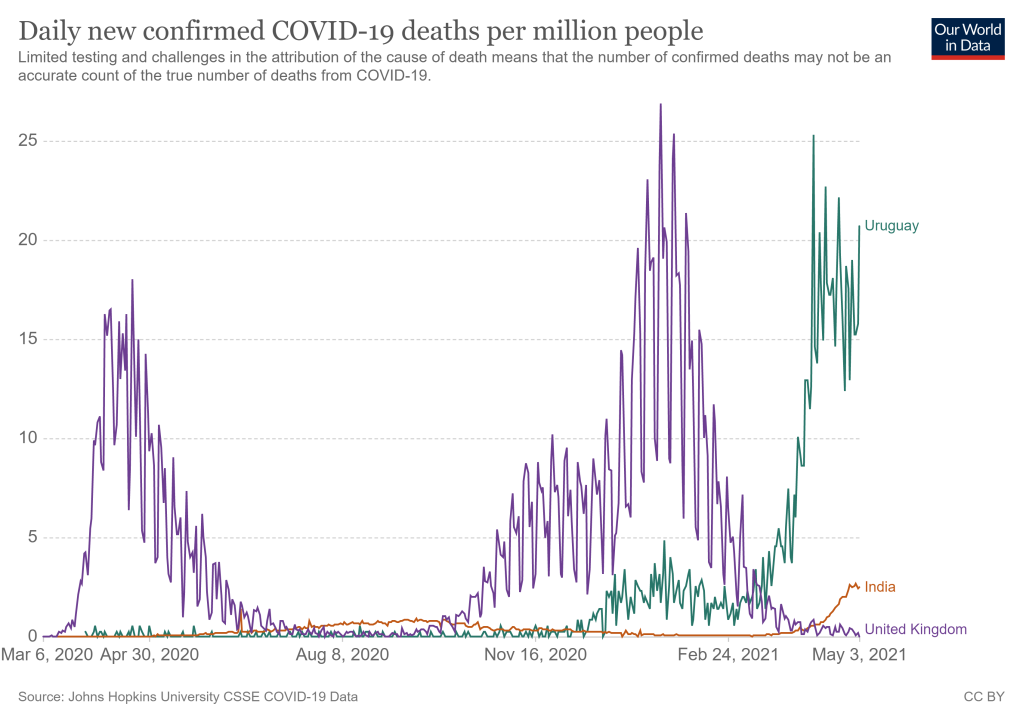
Actually I wouldn’t presume to say what’s really happening from four thousand miles away. But there have been several videos/articles from a lockdown sceptic point of view which do presume to say this – for example here, here and here. All of them make the same general point. The absolute numbers of cases and deaths in India are high compared to other countries, but India has a vast population, if you look at the rates of cases and deaths per million then India is not at all high compared to other countries. They generally include a chart a bit like this one:

I have included the UK and the current frontrunner in deaths per million which is Uruguay.

At first sight this seems like a strong argument, especially as the Indian figures look like they may be peaking. But it ignores two massive points.

First – this is based on official data – it is widely accepted that the actual cases and deaths from India are much greater. The rate of testing is very low so cases are not picked up, people die at home without the government knowing, cemeteries are reporting demand far exceeding local deaths etc.

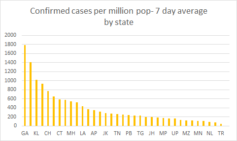
Even if the official data is somewhere close to reality the outbreak is highly concentrated in certain states. Just five states out of 38 ( Maharashtra, Karnataka, Kerala, Uttar Pradesh and Delhi) account for over 50% of cases.

The population of Indian states also varies dramatically, so a better illustration of the concentration is probably confirmed daily cases per million population. This is illustrated below (two very small states with populations less than a million have been excluded. The top five states are: Goa, Delhi, Kerala, Puducherry and Chhattisgarh.

If you examine the five highest death rates for individual states with populations over a million they are comparable to the highest rates in any country (currently Uruguay at 16.66 deaths/day/million). They are the same as the states with the five highest confirmation rates except that Uttarakhand replaces Kerala.

StatePopulation (millions)Official average daily death rate over last 7 days
Goa1.4625.93
Delhi16.7923.70
Puducherry1.2510.28
Uttarakhand10.0110.23
Chhattisgarh25.559.73
Uruguay *3.4616.66 (Rate on 3rd May)
* Uruguay added for comparison

Add that the real death rates are almost certainly much higher and that these numbers are still growing (although the rate of growth is decreasing in some states) and there can be little doubt that these states have a very big problem.

The Philosophy of Lockdowns – asking the right questions?

Socrates

I sometimes wonder if philosophy is any use. Maybe it is just a source of entertainment for those who are interested while real life carries on in a different universe. Then I started to follow the lockdown debate and it suddenly became relevant. For example, it helped me sort the difference between a model of lockdowns as a law of nature and lockdowns as an intervention into a complex system – as described in my previous post. It is also helps me (and presumably others) separate different questions and the appropriate way to answer them – a core philosophy skill.

When it comes to lockdowns I see three questions that can easily get confused.

  1. Do lockdowns work in the sense of significantly lowering the infection rate when an epidemic threatens to get out of control?
  2. Are lockdowns necessary? They may well work, but they aren’t necessary if there are other effective methods of lowering the infection rate or if the rate would have dropped anyway.
  3. Are lockdowns are good idea? Even if they are necessary for lowering for infection rate, the costs may be so high they are not a good idea.

The answer to 1) is almost certainly “yes”. There are countless cases round the world where there has been a Covid outbreak, the authorities have responded with a lockdown, and the outbreak has peaked after a few weeks. I am not aware of any examples where there has been a lockdown and the outbreak has continued regardless. Of course correlation is not causation but we also have a very convincing account of why a lockdown would reverse an outbreak – viruses grow through by passing from one human to another and lockdowns limit human contact a great deal.

The answer 2) seems to me to be “it depends on the context” and “how long are you prepared to wait?”. There are several examples where Covid outbreaks have peaked without a lockdown (Sweden? South Dakota?) and all other virus outbreaks, e.g. flu, have eventually peaked without a lockdown. The reasons seem to vary: change in the weather, local herd immunity, the community changing its behaviour. The trouble is for a decision maker these are hard to predict and may take a very long time. If you have an outbreak in November, you are unlikely to let it rip in the expectation that the weather will turn things around in April. On the other hand if you have an outbreak in March you might take the risk.

The answer to 3) is even more dependent on context and even more complicated. I don’t think we will really know the answer until we see the long term consequences of the lockdowns and the outbreaks. However, I have noticed that discussions often use the wrong sort of evidence. They weigh the harm done by the outbreak – chiefly in terms of excess deaths – against the harms done by the lockdown – economic, mental health etc. What they should be doing is weighing the harms done by the decision to lockdown against the best estimate of harms that would have been done by not locking down. If the lockdown was actually not necessary (see question 2) then this is a no-brainer – clearly the decision to lockdown was a mistake – but if the answer to question 2 is yes, the lockdown was necessary, then we should be balancing harms done by lockdown plus harms done by actual outbreak against estimate of harms done if no lockdown.

This has some interesting consequences for what is appropriate evidence. The more deaths, and the higher the rate of growth of deaths, before the lockdown, the stronger the case for a lockdown, as that is evidence for more deaths if the lockdown had not been implemented. However, the more deaths that occur after the lockdown has been implemented, the weaker the case for a lockdown. These are deaths the lockdown failed to prevent. The same applies to indirect deaths as a result e.g. of having to defer cancer diagnosis. Those that resulted from deferred diagnoses before the lockdown count as evidence for what would have happened without the lockdown. Those that resulted from deferred diagnoses after the lockdown count against the lockdown. Even though the actual deaths may occur months or years later.

I don’t these distinctions being made in most debate on the subject – philosophy recommended!

Do Lockdowns Work? A personal analogy.

A frequent argument from those who oppose lockdowns is that such and such an example (Sweden, South Dakota, insert as appropriate) did not lockdown and yet the virus was no worse than others (Rest of Europe, North Dakota, insert as appropriate) who did lockdown. This leads to much discussion – e.g. Sweden’s citizens behaved as though there was a lockdown and it suffered much more than its immediate neighbours (Norway, Denmark. Finland) with similar culture and climate. That’s all interesting stuff but I want to make a different point.

The argument is based on a scientific model which you might call the lockdown hypothesis. The hypothesis is something on the lines of “the level of lockdown is inversely proportional to the frequency of virus cases given a constant culture and climate”. It is somewhat analogous to Boyle’s Law which could be paraphrased as “the pressure on a gas is inversely proportional to its volume given a constant temperature and number of molecules of gas”. For laws like this a single counterexample is enough to force us to revise the law. If you can demonstrate an example of a gas that does not conform then Boyle’s law needs changing and you pick up a Nobel prize. However, lockdowns aren’t like that. They are interventions into highly complex systems (societies) which sometimes work as expected and sometimes don’t. This is altogether different.

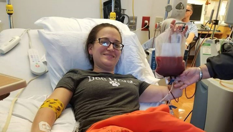
Clearly this isn’t me and she is donating stem cells not having a transplant – but it is the best I could find.

An analogy which seems to work well is a medical treatment and I believe I have an example from my own experience which works particularly well. A stem cell transplant is a very disruptive intervention into a complex system (my body) to address a problem of uncontrolled growth of something bad (my blood cancer). Stem cell transplants are a proven and standard intervention which make a massive difference most of the time. There are also many examples of stem cell transplants with disappointing results and a few examples of patients that go into remission without a stem cell transplant. That doesn’t mean stem cell transplants don’t work. There is a compelling account of how they work – just as there is a compelling account of how lockdowns work. There are countless cases of patients who had cancer and after the stem cell transplant their cancer was much improved – just as there are many, many cases of countries (or states or provinces or whatever) that had the virus badly and after a lockdown the virus was much improved.

With this model individual failures and individual successes without lockdowns do not prove that lockdowns don’t work. It also means that comparing different countries (or states or provinces or whatever) is not very useful – just as there is limited evidence for stem cell transplants comparing the experience of one patient with another. It is much more compelling to look at what tends to happen to a country before and after a lockdown.

There are very few (any?) examples of countries (or states or provinces or whatever) that have implemented a strong lockdown and the virus has not been brought down. The treatment seems to work!

Note that this is about whether lockdowns work. It does not address the different question – are lockdowns a good idea?

Ivor Cummins’ video about Irish TV report on Excess Deaths

Ivor Cummins is a well-known lockdown and mask wearing sceptic who has an active YouTube channel. This short video caught my attention because it is a pretty aggressive attack, and yet I am sure Cummins has made several errors.

The video is about some recent research into excess deaths in Ireland and an Irish TV news item about that research. Excess deaths means the number of deaths in excess of what would normally be expected for a given period. It is one way of measuring the impact of the Covid epidemics.

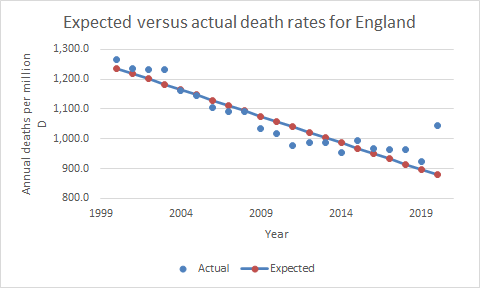
First a few words on calculating the expected number of deaths, which is quite tricky and can be done many ways. Obviously it has to be based on past count of deaths. You probably want to take account of changing population sizes so you need a death rate e.g. deaths/million. (You might also want to take account of changing demographics, especially age. So you might want an age adjusted death rate. However, none of the examples in the video do this.) Clearly you cannot base it on just last year’s rate as rates vary quite a lot from year to year. However, it is also a good idea to allow for trends as over the long term there is a decline in death rates in most countries including Ireland. So the expected rate for the most recent period, e.g. 2020, will be lower than the average for the last few years. This chart illustrates the point. It shows annual actual death rates for England from 2000 to 2020 (because I could easily get this data) .

The overall decline in rates, until the uptick in 2020 for Covid, is clear. The expected rate for 2020 was not the average of the preceding years, it was much lower. What is needed is some kind of regression model to base the expectation on the trend. Here is a model based on simple linear regression (in reality a much more sophisticated regression model is often used). The gap between the actual (blue dot) and expected (red dot) rate for 2020 is a useful estimate of the impact of Covid on overall deaths. You can see how much larger the gap is in comparison to other years where the actual exceeds expected due to things like flu outbreaks.

To return to the video. It appears that the Irish government doesn’t publish timely expected rates. They appear months or even years after the deaths occurred. (It is a bit surprising. Public Health England publishes weekly expected rates, the last report at the time of writing was two weeks ago – April 9th). However, two Irish academics have done their own calculations showing two excess death peaks for March 2020 and March 2021, corresponding to the two Covid waves in Ireland. The Irish TV programme is a short report on that research.

Cummins thinks their approach is wrong and more or less accuses the academics of intentionally misleading the public. Oddly, to make his case he does not use any charts of Irish excess deaths. He starts by using this chart:

This is a very useful chart but it is quite complicated and subtle and I am not convinced Cummins understands it. Euromomo was founded to track deaths due to flu outbreaks and similar events. The “Baseline” rate on the chart is the expected rate based only on years where there were no “additional processes” leading to excess deaths. Additional processes is mainly flu outbreaks but also 2020 because of Covid and some other rarer events. (I am not sure what the “Substantial Increase” line means – presumably some additional years are included). This provides a handy way of showing excess deaths due to those additional processes – most recently Covid. Cummins uses the chart to try and show the seasonality of excess deaths i.e. there are more excess deaths in the winter when flu happens and less in the summer. As it happens the Euromomo chart illustrates quite nicely how much larger the excess deaths due to Covid were than the excess deaths due to flu outbreaks, but that is not the main point. The research project Cummins is criticising doesn’t use the same approach to estimating expected deaths as Euromomo. The expected death rates are for Ireland only and do not exclude “additional processes”. They also estimate death rates on a quarterly basis. Therefore the excess deaths will show no seasonality.

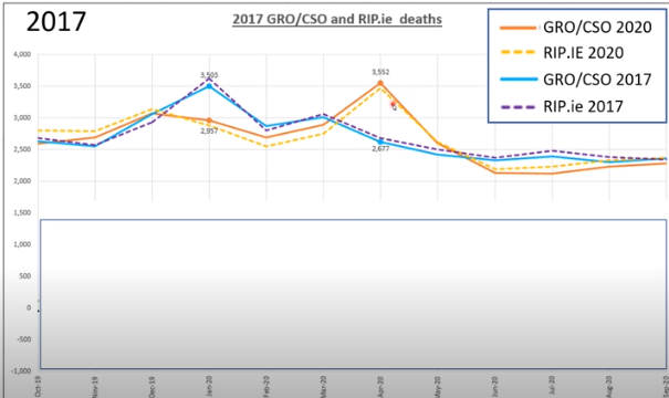
You might expect Cummins to then go on and examine the research he is criticising. But he doesn’t. The next step is to compare 2017 to 2020 actual deaths. This is quite interesting but irrelevant to work on excess deaths that he is criticising.

This is his chart (poor quality because copied directly from video):

It is true that the actual deaths in 2017 are very similar to the actual deaths in 2020. Also the rate of peak deaths is similar. But remember that these are actual not excess death rates. 2017 was a high flu year, while 2020 had almost no flu. Also the trend was for death rates to decline. 2020 should have been a lot lower than 2017 but something, almost certainly Covid, made it much the same. Also the 2020 spike was in April while the 2017 spike was in December. So if the chart was meant to make a point about excess deaths it rather disproves the thesis that excess deaths are seasonal.

Then there is some stuff about what would the figures have been had there been no lockdown. That is of course a key question but it is a whole different debate. There is no scope for addressing it here but personally I don’t think cross geography comparisons prove much unless geographies are very similar. I believe lockdowns sometimes work very well and sometimes work less well depending on all sorts of things including, but not limited to, the specifics of the lockdown, the way people respond, demographics and weather at the time.

In summary, it is not entirely clear what Cummins point is but I think he is claiming that the excess deaths project is faulty because it only includes two peaks and the time between. He thinks it should have included the whole of two years so as to include the non-peak time of year for both peaks. However, this would have added nothing. As discussed above, depending on the way the project estimated expected deaths, excess deaths may not be seasonal at all. But in any case the project is not making a claim about excess deaths for whole years. It is simply pointing to two periods when excess deaths were extremely high. As it happens, if you look at the Euromomo chart you can see there was very little difference between actual and expected deaths outside of the spikes, but that is barely relevant.

PS Does Irish official data on excess deaths really lag months or years? Public Health England publishes them weekly – the most recent being week ending 9th April.