
Ivor Cummins is a well-known lockdown and mask wearing sceptic who has an active YouTube channel. This short video caught my attention because it is a pretty aggressive attack, and yet I am sure Cummins has made several errors.
The video is about some recent research into excess deaths in Ireland and an Irish TV news item about that research. Excess deaths means the number of deaths in excess of what would normally be expected for a given period. It is one way of measuring the impact of the Covid epidemics.
First a few words on calculating the expected number of deaths, which is quite tricky and can be done many ways. Obviously it has to be based on past count of deaths. You probably want to take account of changing population sizes so you need a death rate e.g. deaths/million. (You might also want to take account of changing demographics, especially age. So you might want an age adjusted death rate. However, none of the examples in the video do this.) Clearly you cannot base it on just last year’s rate as rates vary quite a lot from year to year. However, it is also a good idea to allow for trends as over the long term there is a decline in death rates in most countries including Ireland. So the expected rate for the most recent period, e.g. 2020, will be lower than the average for the last few years. This chart illustrates the point. It shows annual actual death rates for England from 2000 to 2020 (because I could easily get this data) .
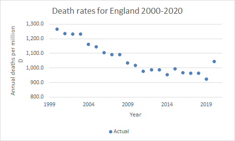
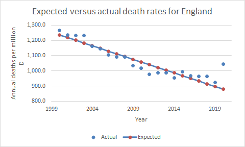
The overall decline in rates, until the uptick in 2020 for Covid, is clear. The expected rate for 2020 was not the average of the preceding years, it was much lower. What is needed is some kind of regression model to base the expectation on the trend. Here is a model based on simple linear regression (in reality a much more sophisticated regression model is often used). The gap between the actual (blue dot) and expected (red dot) rate for 2020 is a useful estimate of the impact of Covid on overall deaths. You can see how much larger the gap is in comparison to other years where the actual exceeds expected due to things like flu outbreaks.
To return to the video. It appears that the Irish government doesn’t publish timely expected rates. They appear months or even years after the deaths occurred. (It is a bit surprising. Public Health England publishes weekly expected rates, the last report at the time of writing was two weeks ago – April 9th). However, two Irish academics have done their own calculations showing two excess death peaks for March 2020 and March 2021, corresponding to the two Covid waves in Ireland. The Irish TV programme is a short report on that research.
Cummins thinks their approach is wrong and more or less accuses the academics of intentionally misleading the public. Oddly, to make his case he does not use any charts of Irish excess deaths. He starts by using this chart:

This is a very useful chart but it is quite complicated and subtle and I am not convinced Cummins understands it. Euromomo was founded to track deaths due to flu outbreaks and similar events. The “Baseline” rate on the chart is the expected rate based only on years where there were no “additional processes” leading to excess deaths. Additional processes is mainly flu outbreaks but also 2020 because of Covid and some other rarer events. (I am not sure what the “Substantial Increase” line means – presumably some additional years are included). This provides a handy way of showing excess deaths due to those additional processes – most recently Covid. Cummins uses the chart to try and show the seasonality of excess deaths i.e. there are more excess deaths in the winter when flu happens and less in the summer. As it happens the Euromomo chart illustrates quite nicely how much larger the excess deaths due to Covid were than the excess deaths due to flu outbreaks, but that is not the main point. The research project Cummins is criticising doesn’t use the same approach to estimating expected deaths as Euromomo. The expected death rates are for Ireland only and do not exclude “additional processes”. They also estimate death rates on a quarterly basis. Therefore the excess deaths will show no seasonality.
You might expect Cummins to then go on and examine the research he is criticising. But he doesn’t. The next step is to compare 2017 to 2020 actual deaths. This is quite interesting but irrelevant to work on excess deaths that he is criticising.
This is his chart (poor quality because copied directly from video):

It is true that the actual deaths in 2017 are very similar to the actual deaths in 2020. Also the rate of peak deaths is similar. But remember that these are actual not excess death rates. 2017 was a high flu year, while 2020 had almost no flu. Also the trend was for death rates to decline. 2020 should have been a lot lower than 2017 but something, almost certainly Covid, made it much the same. Also the 2020 spike was in April while the 2017 spike was in December. So if the chart was meant to make a point about excess deaths it rather disproves the thesis that excess deaths are seasonal.
Then there is some stuff about what would the figures have been had there been no lockdown. That is of course a key question but it is a whole different debate. There is no scope for addressing it here but personally I don’t think cross geography comparisons prove much unless geographies are very similar. I believe lockdowns sometimes work very well and sometimes work less well depending on all sorts of things including, but not limited to, the specifics of the lockdown, the way people respond, demographics and weather at the time.
In summary, it is not entirely clear what Cummins point is but I think he is claiming that the excess deaths project is faulty because it only includes two peaks and the time between. He thinks it should have included the whole of two years so as to include the non-peak time of year for both peaks. However, this would have added nothing. As discussed above, depending on the way the project estimated expected deaths, excess deaths may not be seasonal at all. But in any case the project is not making a claim about excess deaths for whole years. It is simply pointing to two periods when excess deaths were extremely high. As it happens, if you look at the Euromomo chart you can see there was very little difference between actual and expected deaths outside of the spikes, but that is barely relevant.
PS Does Irish official data on excess deaths really lag months or years? Public Health England publishes them weekly – the most recent being week ending 9th April.
